Pinterest Pixel

How to Graph Normal Distribution in Excel Fast

John Michaloudis
Delve into the depths of data oceans to uncover treasures of insight.
Microsoft Excel's prowess in visualizing data as a normal distribution chart, resembling a bell curve, is a golden tool for clear observations and informed decisions.

Bridging statistical concepts with Excel empowers quick analysis and transforms raw data into meaningful visual representations.
How to Graph Normal Distribution in Excel Fast | MyExcelOnline How to Graph Normal Distribution in Excel Fast | MyExcelOnline

Key Takeaways:

  • Excel bridges statistical concepts with intuitive visualization, empowering swift analysis in fields like quality control and risk assessment.
  • The NORM.DIST function calculates probability density within a normal distribution, offering a powerful tool for data analysis.
  • A step-by-step guide facilitates the creation of bell curves in Excel, enabling users to visualize data distributions effectively.
  • Practical tips highlight common mistakes to avoid when graphing normal distributions, ensuring accuracy in analysis.


Introduction to Normal Distribution in Excel

The Power of Data Visualization with Normal Distribution

When you dive into the oceans of data that surround us nowadays, you’ll understand why finding patterns and insights is like finding treasure. Excel’s capability to display data as a normal distribution chart, often referred to as a bell curve, is one such golden tool. In visual form, this bell-shaped graph can brilliantly illuminate the typical distribution pattern of your data, allowing for clear observations and informed decisions.

Normal Distribution in Excel

With a bell curve in Excel, you can predict occurrences and understand phenomena in various fields, such as quality control, performance analysis, and risk assessment, all within the familiar environment of your spreadsheet. Visualizing normal distribution helps you to comprehend the consistency of a process or the expected variation within a set of data – making you a master of your numbers.

Bridging Statistics and Excel for Quick Analysis

Excel isn’t just about crunching numbers; it’s a bridge that connects the world of statistics with your analytical prowess. With a solid understanding of statistical concepts like mean, median, and standard deviation, you can transform raw data into meaningful normal distribution graphs swiftly. Excel serves as a potent tool in your analytical arsenal, bringing the abstract concepts of statistics to a concrete visual form that’s much simpler to grasp and interpret.

Whether you’re a business analyst forecasting sales or a quality manager monitoring product defects, the alliance of Excel with statistical methods equips you with the power to perform quick analysis. The software’s built-in statistical functions and graphing capabilities mean that even with a basic understanding of statistics, you can utilize Excel to represent complex data distributions in a comprehensible and actionable manner.


NORM.DIST Formula

What is NORM.DIST function?

The NORM.DIST function is a statistical function in Excel used to calculate the probability density function (PDF) for a given value in a normal distribution. It returns the probability that a variable falls within a specified range, based on the mean and standard deviation of the distribution.

Here’s the syntax of the NORM.DIST function:

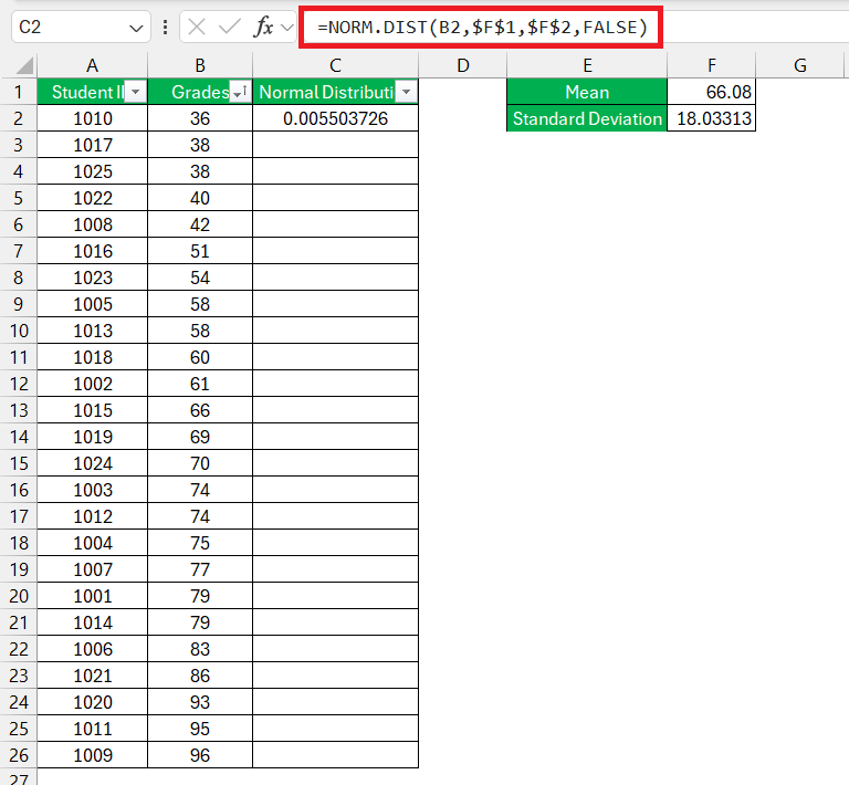
=NORM.DIST(x, mean, standard_dev, cumulative)

  • x: This represents the value for which you seek to determine the probability.
  • mean: This denotes the arithmetic mean (average) within the distribution.
  • standard_dev: This signifies the standard deviation characterizing the distribution.
  • cumulative: This represents a logical value that dictates the distribution type. If set to TRUE, the function returns the cumulative distribution function (CDF), which is the probability that a random variable takes a value less than or equal to x. If set to FALSE, the function returns the probability density function (PDF), which represents the probability density of a continuous random variable falling within a particular range.

Overall, the NORM.DIST function is a powerful tool in Excel for analyzing and working with data that follows a normal distribution, which is a common assumption in many statistical analyses.


Step-by-Step Guide to Creating a Bell Curve

Calculate Normal Distribution

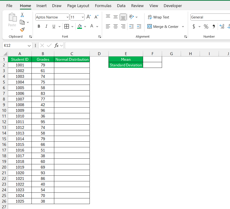
Here we have the grades of the students and we want to create a bell curve using this data –

Normal Distribution in Excel

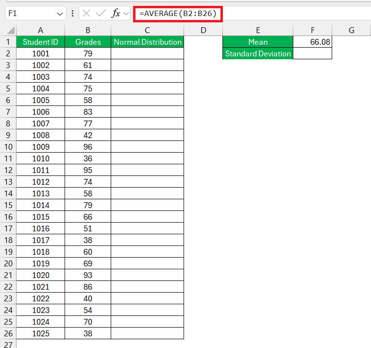
STEP 1: First, find the mean of the dataset, which represents the average value.

Normal Distribution in Excel

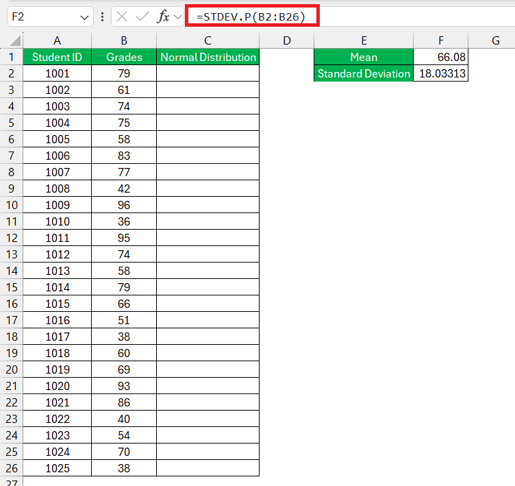
STEP 2: Next, determine the standard deviation for the provided data.

Normal Distribution in Excel

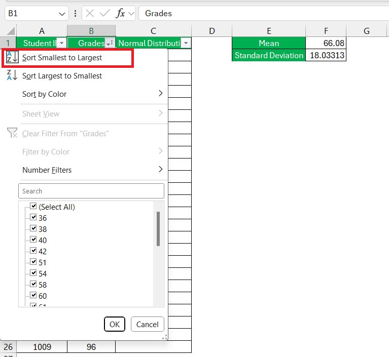
STEP 3: Right-click the data column and select Sort smallest to largest.

Normal Distribution in Excel

STEP 4: Calculate the normal distribution using Excel’s built-in formula – NORM.DIST.

Normal Distribution in Excel

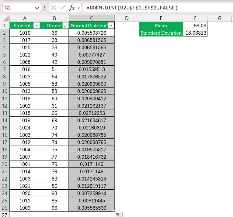
STEP 5: Subsequently, drag the formula down to apply it to the entire dataset.

Normal Distribution in Excel

The column for the normal distribution of the data will be created.


Normal Distribution Graph

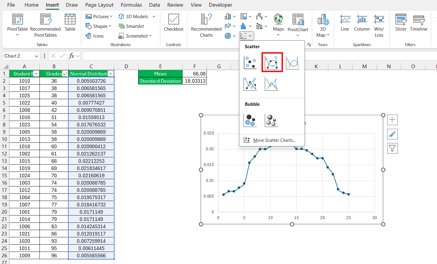
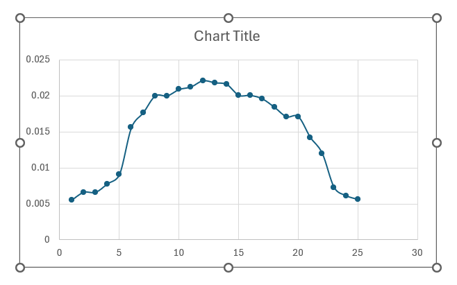
To create a normal distribution graph, navigate to the “Insert” tab, and under “Charts,” choose a “Scatter” chart with smoothed lines and markers.

Normal Distribution in Excel

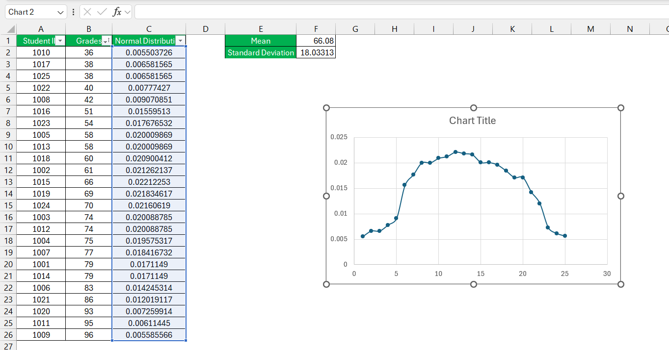
Upon inserting the chart, you’ll observe the creation of our bell curve or normal distribution graph.

Normal Distribution in Excel


Practical Tips and Tricks

Avoiding Common Mistakes in Graphing Normal Distribution

Navigating the waters of graphing normal distribution in Excel can sometimes be tricky, and it’s easy to make a few mistakes along the way. One common slip-up is overlooking the necessity for a sufficiently large dataset to represent a true normal distribution. The law of large numbers is your ally here, ensuring the pattern you’re observing isn’t just a statistical fluke.

Another hiccup could be misapplying the mean and standard deviation. Double-check your calculations and ensure they’re based on the right data set; this will avoid skewing your graph erroneously. Also, remember to use the correct Excel chart type—mixing up chart types can lead to incorrect interpretations of the data.

Taking the time to review your steps can save you from these pitfalls, allowing your bell curve to accurately reflect your insightful analysis.


FAQs

1: Can Excel handle large data sets for normal distribution graphs?

Absolutely, Excel can manage large data sets for normal distribution graphs with ease. It’s built to handle thousands of data points, allowing you to analyze and visualize extensive information without a hitch. Just ensure your computer has adequate processing power to operate smoothly when dealing with particularly sizable datasets.

2: How can I ensure my bell curve is accurately scaled in Excel?

To ensure your bell curve is accurately scaled in Excel, first check that your data is correctly entered and that you’ve calculated the mean and standard deviation accurately. Then, when creating the chart, carefully adjust the axis options to appropriately fit the range of your data and maintain consistent intervals.

3: How to calculate the normal distribution in Excel?

To calculate the normal distribution in Excel, you can use the NORM.DIST function. Enter the x value, mean, and standard deviation, and set the cumulative parameter to TRUE for the cumulative distribution function or FALSE for the probability density function. Then hit Enter to see the result.

4: How do I sort data into a normal distribution in Excel?

Sorting data into a normal distribution isn’t something you do to your data per se. Instead, what you’ll likely want to do is graph your data on a bell curve to see if it approximates a normal distribution. Use Excel’s chart functions to create a histogram or scatter plot with a trendline to visualize the distribution.

5: Which area of financial analysis did you meet the normal distribution?

You’ll often encounter the normal distribution in financial analysis when assessing investment returns, as many asset returns tend to follow a distribution pattern that can be modeled by a bell curve. It’s crucial in risk management, portfolio optimization, and in the application of the Black-Scholes model for options pricing.

6: How do I create a bell curve graph in Excel?

To create a bell curve graph in Excel, enter your data, calculate the mean and standard deviation, and then use the NORM.DIST function to create a normal distribution set based on your data. Select this set and insert a Scatter Plot with Smooth Lines to get your bell curve. Adjust the chart elements as needed for clarity.

If you like this Excel tip, please share it
Founder & Chief Inspirational Officer at

John Michaloudis is a former accountant and finance analyst at General Electric, a Microsoft MVP since 2020, an Amazon #1 bestselling author of 4 Microsoft Excel books and teacher of Microsoft Excel & Office over at his flagship MyExcelOnline Academy Online Course.

See also  How to Make Ogive Graph in Excel for Data Analysis - Step by Step Guide

Star 30 Days - Full Access Star

One Dollar Trial

$1 Trial for 30 days!

Access for $1

Cancel Anytime

One Dollar Trial
  • Get FULL ACCESS to all our Excel & Office courses, bonuses, and support for just USD $1 today! Enjoy 30 days of learning and expert help.
  • You can CANCEL ANYTIME — no strings attached! Even if it’s on day 29, you won’t be charged again.
  • You'll get to keep all our downloadable Excel E-Books, Workbooks, Templates, and Cheat Sheets - yours to enjoy FOREVER!
  • Practice Workbooks
  • Certificates of Completion
  • 5 Amazing Bonuses
Satisfaction Guaranteed
Accepted paymend methods
Secure checkout

Get Video Training

Advance your Microsoft Excel & Office Skills with the MyExcelOnline Academy!

Dramatically Reduce Repetition, Stress, and Overtime!
Exponentially Increase Your Chances of a Promotion, Pay Raise or New Job!

Learn in as little as 5 minutes a day or on your schedule.

Learn More!

Share to...