Regression Analysis is a powerful tool used in various fields like economics, finance, healthcare, insurance, etc to understand the impact of independent variables on dependent variables.
In this article, we will be learning how to run Regression in Excel –
Let’s look at each one of these in detail!
Download the Excel Workbook below to follow along and understand all about Regression Analysis –
download excel workbookRegression-in-Excel.xlsx
Table of Contents
What is Regression?
Regression is a statistical method used for the estimation of relationships between two variables – one dependent variable (Y) and one or more independent variables (X). It is used to determine how the value of Y changes with respect to the change in the value of X.
We try to regress the value of the dependent variable using the independent variables. Let’s understand this with the help of an example –
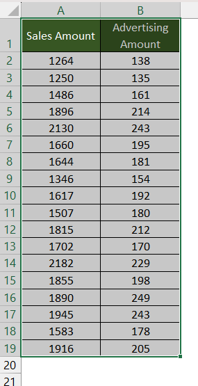
Suppose we have the past data on the total monthly sales amount of a product and the amount spent on advertising the product. We can easily run a regression between the two variables to analyze whether there is a relationship between the two.
In this case, the independent variable (X) is the amount spent on advertising and the dependent variable (Y) is the total sales amount. We can also use regression to predict the future sales of the product based on the forecasted advertising amount.
Install Data Analysis
Click on Data Tab in Excel Ribbon and look for Data Analysis. If not found, follow the steps below to install it –
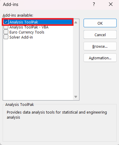
STEP 1: Go to Search Bar and type Add-Ins.
STEP 2: Select Analysis ToolPak and Click OK.
You will now see Data Analysis in the Data Tab!
How to Run Regression in Excel?
Follow the steps below to run regression in Excel using in-built regression tools –
STEP 1: Go to Data Tab > Data Analysis.
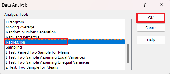
STEP 2: In the Data Analysis dialog box, click on Regression and then OK.
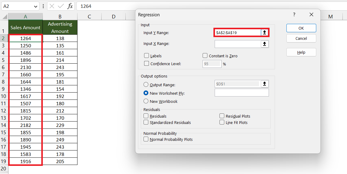
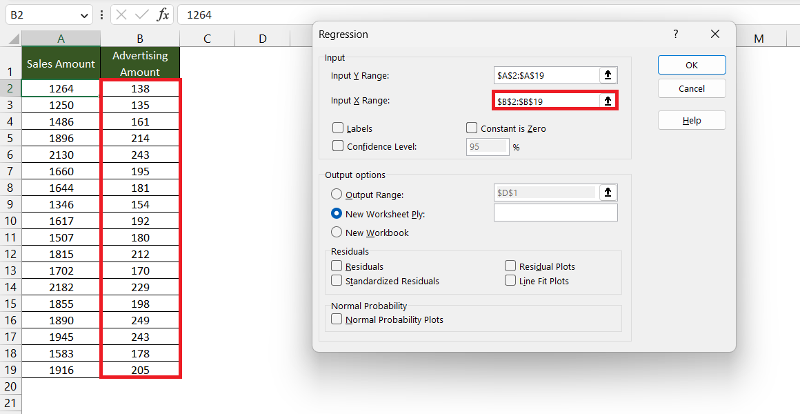
STEP 3: In the Regression dialog box, input the Y range i.e. the dependent variable. Here, it is the column containing the sales amount ($A$2:$A$19).
STEP 4: Input the X range i.e. the independent variable. Here, it is the column containing the advertising amount ($B$2:$B$19).
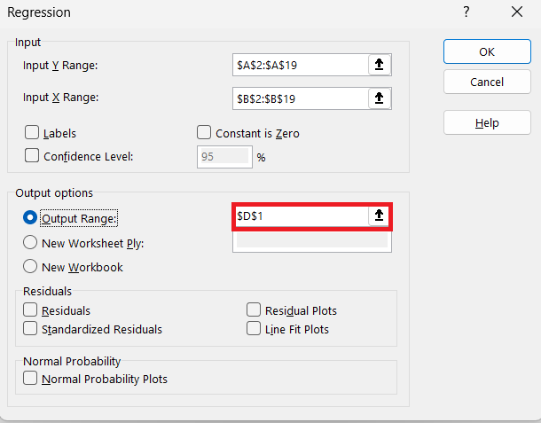
STEP 5: Input the output range i.e. the cell location where you want to display the output summary. Here, it is $D$1.
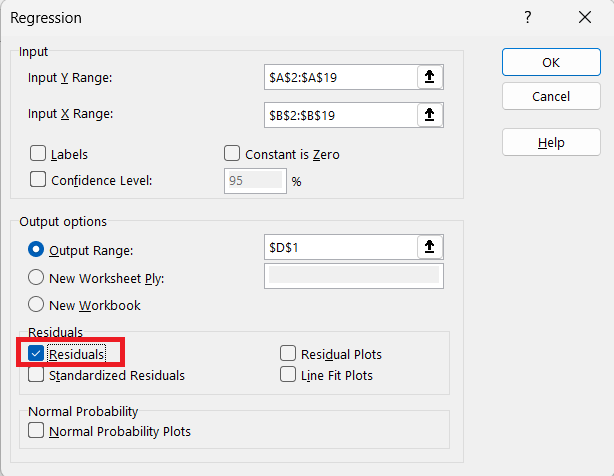
STEP 6: Check the Residuals box.
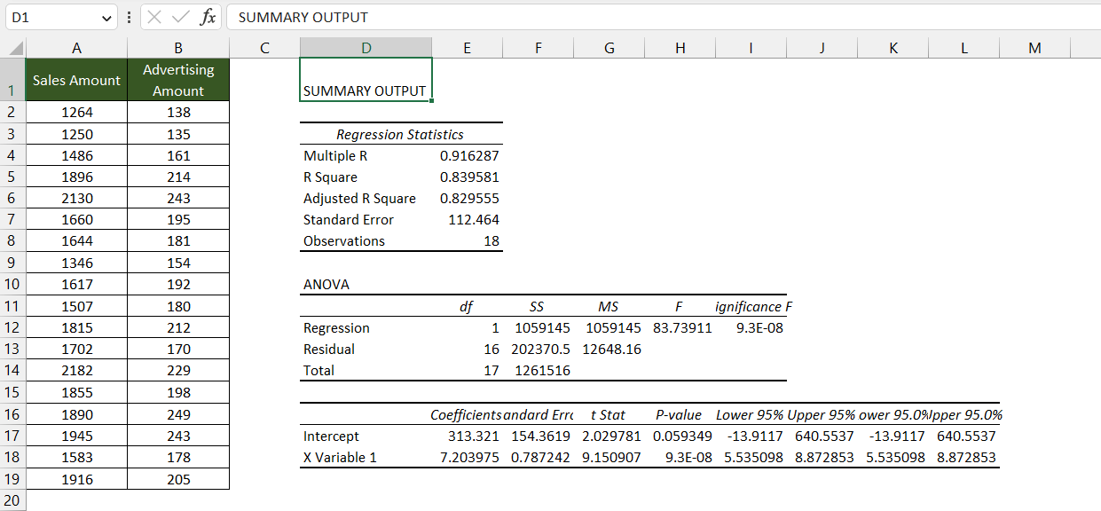
The output summary will now be displayed in the worksheet.
Let’s understand this summary output in detail!
Interpret the Results
Once you run regression in Excel, all the calculations are performed and the result is displayed. It is important to understand the meaning of the terms used in the output to clearly interpret the result.
Summary Output
This tells us how well the linear regression fits the data source.
Multiple R – It tells us the strength of the relationship between the two variables. The larger the number, the stronger the relation. The value ranges from -1 to 1:
- 1 indicates a strong positive relationship
- -1 indicates a strong negative relationship
- 0 indicates no relation
Here, the value is 0.916 which means that there is a strong positive relation between the sales amount and the amount spent on advertising.
R Square – It tells us how much of the variation of a dependent variable is explained by an independent variable in a regression. It is an indicator of the goodness of fit. Generally, an R square of 95% is considered as a good fit.
In our example, the value is 0.84 which means 84% of the dependent variable is explained by the independent variable.
Adjusted R Square – This value is considered an adjusted value for R square when we are running a multiple regression.
Standard Error – It is another goodness of fit measure that tells us the precision of the regression analysis.
ANOVA
This analysis of the variance table tells us about the level of variability within the regression model.
- df is the degree of freedom associated with the source of variances.
- SS is the sum of squares. The smaller the value, the better the model fits the source data.
- MS is the mean square.
- F is the F-test for determining the overall significance of a regression model.
- Significance f is the p-value for the F-test. It tells us if the results are statistically significant and reliable. Generally, if the value is less than 0.05 the model is good to go.
Regression Coefficients
Based on these two values mentioned in the table, we can easily create a Regression Equation –
Y = Intercept + X * Coefficient
After running the regression analysis, we have obtained the following results:
- Intercept – 313.3
- Coefficient – 7.2
So, the Equation will be:
Sales Amount = 313.3 + 7.2 * Advertising Amount
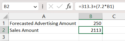
Using this equation, we can predict the sales amount based on the forecasted amount that will be spent on advertising. If the forecasted value is 250, the sales amount will be –
= 313.3+7.2*250
=2113
So, if we spend $250 on advertising then the sales amount should be around $2113.
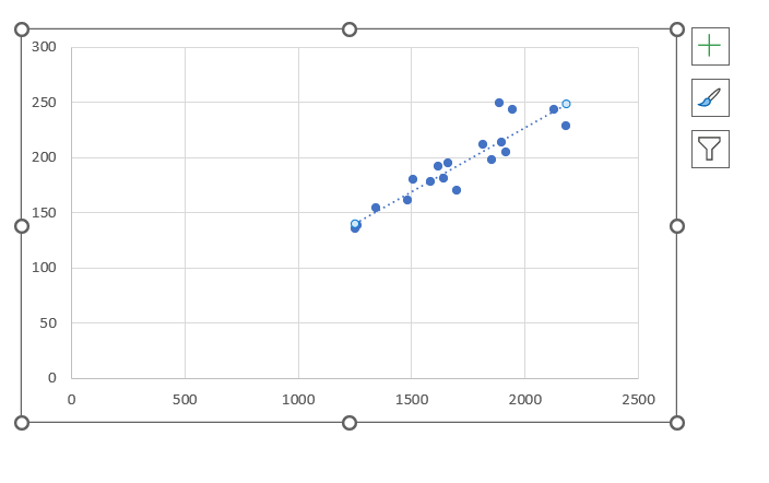
Create Linear Regression Graph
To visualize the relationship between the two variables using a regression graph, follow the steps mentioned below –
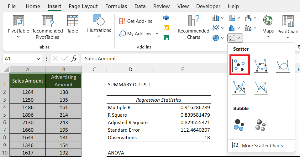
STEP 1: Select the Data including the headers.
STEP 2: Go to Insert and select Scatter under the Charts section. Select an appropriate Scatter Chart as required.
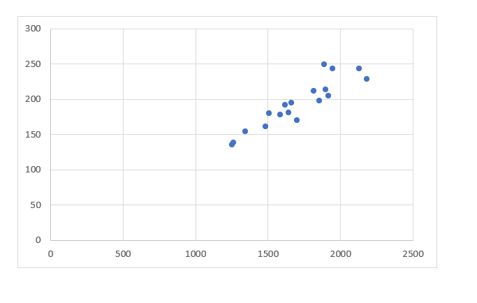
A Scatter Chart will be added to the worksheet.
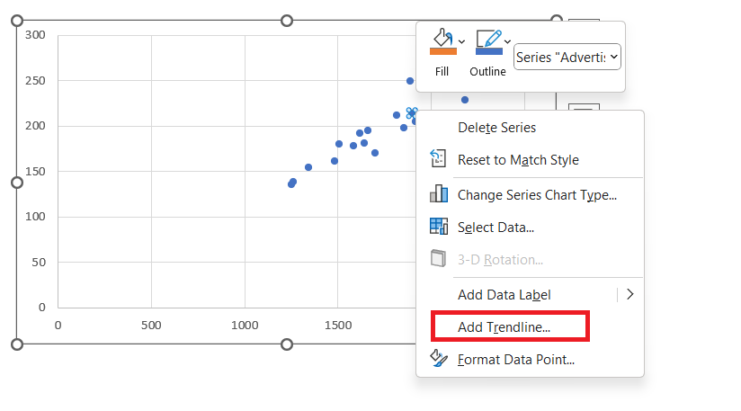
STEP 3: Right-click on any of the data points and select Add Trendline.
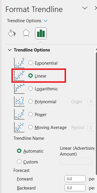
STEP 4: In the Format Trendline dialog box, select Linear.
A Regression Line will be added to the graph.
Click here for a definitive guide on How to Make a Graph in Excel!
Conclusion
Further Learning:
- Excel Chart Template Infographic
- Project Milestone Chart Using Excel
- Create an Excel Sunburst Chart With Excel 2016
John Michaloudis is a former accountant and finance analyst at General Electric, a Microsoft MVP since 2020, an Amazon #1 bestselling author of 4 Microsoft Excel books and teacher of Microsoft Excel & Office over at his flagship MyExcelOnline Academy Online Course.

